Friday, 10 April 2015

Ancillary Product #1: FINAL Poster Design
I made a few changes to the original design by altering the font and making it more grey than white so the text isn't obtrusively bright when the details at the bottom of the poster are much more important.

Ancillary Product #2: FINAL Film Article
The difference between this article and the previous draft is how I've desaturated the image further to make it look as if the characters are ill, thus intensifying the ominous mood the reader is sure to feel when considering the nature of the film. It also helps to enhance the verisimilitude of the film by reflecting the world as it is in the film: an apocalyptic society, overrun by psychotically disturbed individuals.

N.B. Centre line is there to indicate that this is a double page spread.
Evaluation: Question 4 // How did you use media technologies in the construction and research, planning and evaluation stages?
In addition to the information already provided, it's important for me to mention that since AS Media I have used YouTube more thoroughly to my advantage, implementing it to source short films for me to analyse the codes and conventions of, informing my final product later on in the course. I moved from using Final Cut Pro to edit my film in year 12, to moving on to using Adobe Premier Pro, one of the latest editing software available to me. This programme allowed me to further my skills by providing more editing elements such as different forms of filters (noise, lighting, tint, colour corrector etc.) for me to work with. Where in AS media, my group and I used a few filters, de-satirising the image, in A2 I could use Premier Pro to add more, advanced filters. This is also a similar case for sound editing software already built into Premier Pro at an advanced level, far greater than Final Cut. I was required to film more in the evaluation stages of the project which has allowed me to explore a full range of editing techniques. In the evaluation videos, I have shots running alongside the original footage of me talking, which is an editing technique I have since developed from AS media.
Wednesday, 8 April 2015
Evaluation: Question 3 // What have you learned from your audience feedback?
In addition to what I've already discussed in the videos above, it's important to note that obtaining audience feedback helped to provide me with my target audiences' thoughts on the film and ancillary products: particularly when they are less likely to look at it on a technical side, but rather as something with a good narrative (film) and in analysing whether the ancillary products are aesthetically pleasing. By gaining this I was able to improve my film by making it run as smoothly as a professional film and to make it thus more appealing to my target audience. With regard to the two ancillary products, obtaining feedback led me to create a more effective poster and film article, that suited both the conventions of a poster/ magazine article but also the genre too.
As a film maker, it's essential to have feedback from your target audience so you can be assured that the target audience will enjoy the film. If they enjoy it, then they are more likely to promote it, further marketing your products through 'word-of-mouth' and sharing over social media. This gives your film and products more publicity, and if it was to be released professionally, a greater profit.
Monday, 6 April 2015
Wednesday, 1 April 2015
Ancillary Product #2: Film Article Draft 4
I altered the saturation in this picture to make the atmosphere more dark and foreboding, leading the reader to suppose the film will have a strong sense of antagonism about it.


Ancillary Product #2: Film Article Draft 3
I changed the article yet again by making the font of the quote the same as the sub-heading and changing the red text boldness and colour very slightly.


Ancillary Product #2: Film Article Draft 2
In this post you'll find the second draft of my film article with some of the changes made as a result of looking at the feedback from my target audience. You'll see that changed the colour of the text for the sub-heading, amended spelling mistakes, reduced the body text size to size 18 and finally added the standard magazine details found at the bottom of either page (which is conventional of magazines to use).


Ancillary Product #2: Film Article Audience Feedback
Do you think the colour of the title 'Derange' ought to be brighter (whiter)?
Three people said that the text didn't need to be brighter however two individuals said yes, with one saying that the title ought to be slightly bolder, made so by adding an outline to make it stand out.
Does the way the picture is edited look effective?
Four people believed the picture did look effective although one individual (the youngest person at 15 years old) said that I should make the image more 'grainy'/ foggy so as to make the picture look as if the characters really are in an apocalyptic world.
Does it help to convey the sci-fi genre?
All individuals, bar one, agreed that the article helped to convey the sci-fi genre.
Is it necessary to have page numbers?
Four individuals said it was necessary to include page numbers in order to make it obvious to the reader that this is a magazine article (since after all, it is a convention of magazine articles to include this). Only one person said that they weren't.
Do the fonts need to be changed?
Four people believed the fonts didn't need changing although one person did say that they could possibly be changed to make the article look more interesting.
Does the body text need enlarging?
Two people thought the body text does need enlarging whereas the other three didn't. When doing my research on magazine conventions I found that magazines typically use a body text font with either size 8 or size 12. Already, the body text in my article is size 24 so in theory, rather than enlarging it, I need to reduce the size.
Do you like it?
All of the people I asked did like it.
Is it clear that the poster represents a stereotypically heterosexual couple?
Many, if not all of the people I asked said that it wasn't so obvious that they were a couple but they all got the reading that the two characters were working together to fight whatever antagonism is faced in the film.
Any additional improvements?
Changing the colours of the fonts to make the article more interesting was one of the changes offered. Furthermore, one person identified a few spelling mistakes which I need to amend. In addition to this, another individual said that I could apply a black gradient onto the bottom of the image which would essentially help to make the text stand out.
Three people said that the text didn't need to be brighter however two individuals said yes, with one saying that the title ought to be slightly bolder, made so by adding an outline to make it stand out.
Does the way the picture is edited look effective?
Four people believed the picture did look effective although one individual (the youngest person at 15 years old) said that I should make the image more 'grainy'/ foggy so as to make the picture look as if the characters really are in an apocalyptic world.
Does it help to convey the sci-fi genre?
All individuals, bar one, agreed that the article helped to convey the sci-fi genre.
Is it necessary to have page numbers?
Four individuals said it was necessary to include page numbers in order to make it obvious to the reader that this is a magazine article (since after all, it is a convention of magazine articles to include this). Only one person said that they weren't.
Do the fonts need to be changed?
Four people believed the fonts didn't need changing although one person did say that they could possibly be changed to make the article look more interesting.
Does the body text need enlarging?
Two people thought the body text does need enlarging whereas the other three didn't. When doing my research on magazine conventions I found that magazines typically use a body text font with either size 8 or size 12. Already, the body text in my article is size 24 so in theory, rather than enlarging it, I need to reduce the size.
Do you like it?
All of the people I asked did like it.
Is it clear that the poster represents a stereotypically heterosexual couple?
Many, if not all of the people I asked said that it wasn't so obvious that they were a couple but they all got the reading that the two characters were working together to fight whatever antagonism is faced in the film.
Any additional improvements?
Changing the colours of the fonts to make the article more interesting was one of the changes offered. Furthermore, one person identified a few spelling mistakes which I need to amend. In addition to this, another individual said that I could apply a black gradient onto the bottom of the image which would essentially help to make the text stand out.
Friday, 27 March 2015


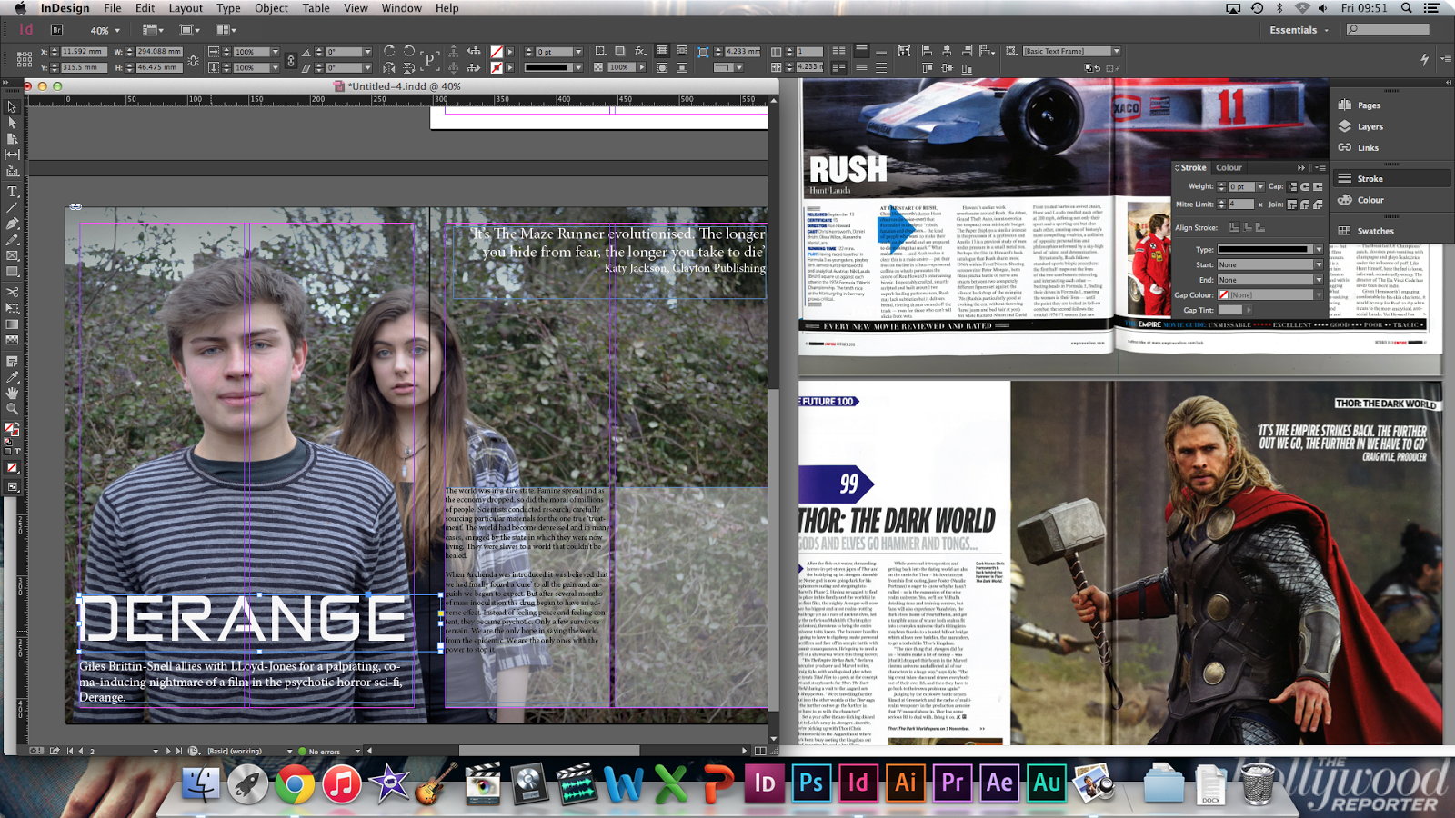
Ancillary Product #2: Film Article Production Day 2
Today I spent a further 3 hours finalising my film article. Below you'll find screenshots capturing the progress I have made. This predominantly included working with the programme (Indesign) to pick the right font and layout for specific elements in the film article. One of the more noticeable changes I made was in removing the background for the body text because altogether, the article looked more effective without them. Furthermore, you'll notice that in the third screenshot, the picture is darker than the former picture (in the screenshots) and this is because after speaking to my media teacher, it was agreed that to make the image look darker, with a much greater impact to be felt, I should edit it further on Photoshop- which I've now done.


Thursday, 26 March 2015
Ancillary Product #2: Film Article Production
In the images below you can see the stages I'm going through to create the film article. In the screenshots you will find that I'm using Indesign to make my film article. When I created a new document I added three pages so I could bring two together to make the two pages of the magazine article. Two columns were added to both sides but only those on the right will be used. I plan on having the title on the left with a short descriptive line about the film beneath it. A quote will be added to the top right corner of the article. This quote will either be a quote from another reputable brand (invented by myself) or a quote from the text (a pull quote). Below this, will be the start/ full article.
As an additional note, I went about making the coloured boxes for text by inserting a rectangle shape and filling it with an off-white tone (slightly blue),which I then knocked down in opacity to 50%.


Wednesday, 25 March 2015
Ancillary Product #2: Film Article Possible Designs
Below are two images which I'm considering using as the central image to my film article. Both have been edited on Photoshop through manipulating the brightness, contrast and the colour (very slightly). Using the brush tool and applying an opacity of 15% to black paint, I painted around the edges of the image to make the picture appear a lot more ominous and to cause the actors to contrast well with the background.


Ancillary Product #2: Magazine Article Research // Action, Sci-Fi, Thriller
Predator (1987)
The article as a whole, is cast in shadow by the the image which masters the double page spread. A filter has been used to cast elements of the picture in darkness, creating a foreboding atmosphere. This immediately suggests that the film must have themes of horror involved (where thriller comes into it). The bright lights behind the main character are examples of the types of special effects we might see from watching sci-fi films which means we can infer from this that the film is a sci-fi film.
The predator in the picture is wearing a helmet and a protective chest plate which, although unconventional, is a form of military uniform. Since this means we can expect violence to be a key theme throughout this film, we are made to understand that it is an action film. The nature of the suit being large and of an inhuman appearance, this leads us to assume that the character in the article is an alien. Therefore the article informs us of the sci-fi genre through the inclusion of the predator.
From looking at the the picture and the information at the bottom and top of the article (i.e. 'ALIEN' in the top right hand corner and the title, 'The Ultimate Sci-fi Movie Special') we are led to understand that the target audience is sci-fi fans.
.png)
The article as a whole, is cast in shadow by the the image which masters the double page spread. A filter has been used to cast elements of the picture in darkness, creating a foreboding atmosphere. This immediately suggests that the film must have themes of horror involved (where thriller comes into it). The bright lights behind the main character are examples of the types of special effects we might see from watching sci-fi films which means we can infer from this that the film is a sci-fi film.
The predator in the picture is wearing a helmet and a protective chest plate which, although unconventional, is a form of military uniform. Since this means we can expect violence to be a key theme throughout this film, we are made to understand that it is an action film. The nature of the suit being large and of an inhuman appearance, this leads us to assume that the character in the article is an alien. Therefore the article informs us of the sci-fi genre through the inclusion of the predator.
From looking at the the picture and the information at the bottom and top of the article (i.e. 'ALIEN' in the top right hand corner and the title, 'The Ultimate Sci-fi Movie Special') we are led to understand that the target audience is sci-fi fans.
Ancillary Product #2: Magazine Article Research // Adventure, Sci-fi
The Hunger Games: Catching Fire (2013)
In the analysis below, I've described how the use of grey tones is important in conveying the sci-fi genre since it is a colour often prescribed a futuristic connotation. The symbol in the background is the mark of the Capitol, a leading body, similar to a corrupt government. The inclusion of this unknown symbol reinforces our reading that it is a sci-fi film because it is a symbol not used in today's society so can only be relevant to a future world/ different world. Furthermore, the characters' costumes are similar to wetsuits, however they are minorly different in the way they are universally the same. The texture is unusual. Often we prescribe unusual costume/ appearance/ film sets with the sci-fi genre because sci-fi films deal with unusual things. Therefore the sci-fi genre is further reinforced through the costume.
By including the former review of the first Hunger Games, the reader is made aware of the fact that both The Hunger Games and Catching Fire are linked together. Fans of the book and the first film will be aware that that film comes under the adventure genre. Including the first review will mean that the reader will come to understand that as a follow on from the first film, Cathing Fire will similarly be an action film.
The picture presents Katniss Everdeen as subverting the feminine stereotype. As we see, Katniss is wearing the same costume as Peeta showing that the two are equal. However we also find that she is standing further forward, implying she is the most important character in the film and that as a result, she is more critical to the plot and thus more powerful than Peeta. This shows she is subverting the feminine stereotype because conventionally women would have been seen as inferior to men. Moreover, Katniss' hair is tied back in a plait, connoting practicality, which is a stereotypically masculine attribute. This reinforces the reading that she subverts the feminine stereotype. As discussed, Peeta stands back from Katniss implying he is inferior, showing he subverts the masculine stereotype.
Both characters stand defiantly together, suggesting that they are are part of a great cause. Defiance implies the characters are courageous and have strong will which is often found and explored in adventure films. The lighting behind them, making it appear as if they are in the sky, suggests they must be the protagonists for the light is a sign of hope. It is conventional for film articles to use bright light to give the reading that the characters are the protagonists and a dark filter to imply that either the characters are the antagonists and/or that the film is dark and twisted.
Since there are no horrific images of violence or pain we can assume that the article is aimed at young adults/ a 12+ audience.
.png)
In the analysis below, I've described how the use of grey tones is important in conveying the sci-fi genre since it is a colour often prescribed a futuristic connotation. The symbol in the background is the mark of the Capitol, a leading body, similar to a corrupt government. The inclusion of this unknown symbol reinforces our reading that it is a sci-fi film because it is a symbol not used in today's society so can only be relevant to a future world/ different world. Furthermore, the characters' costumes are similar to wetsuits, however they are minorly different in the way they are universally the same. The texture is unusual. Often we prescribe unusual costume/ appearance/ film sets with the sci-fi genre because sci-fi films deal with unusual things. Therefore the sci-fi genre is further reinforced through the costume.
By including the former review of the first Hunger Games, the reader is made aware of the fact that both The Hunger Games and Catching Fire are linked together. Fans of the book and the first film will be aware that that film comes under the adventure genre. Including the first review will mean that the reader will come to understand that as a follow on from the first film, Cathing Fire will similarly be an action film.
The picture presents Katniss Everdeen as subverting the feminine stereotype. As we see, Katniss is wearing the same costume as Peeta showing that the two are equal. However we also find that she is standing further forward, implying she is the most important character in the film and that as a result, she is more critical to the plot and thus more powerful than Peeta. This shows she is subverting the feminine stereotype because conventionally women would have been seen as inferior to men. Moreover, Katniss' hair is tied back in a plait, connoting practicality, which is a stereotypically masculine attribute. This reinforces the reading that she subverts the feminine stereotype. As discussed, Peeta stands back from Katniss implying he is inferior, showing he subverts the masculine stereotype.
Both characters stand defiantly together, suggesting that they are are part of a great cause. Defiance implies the characters are courageous and have strong will which is often found and explored in adventure films. The lighting behind them, making it appear as if they are in the sky, suggests they must be the protagonists for the light is a sign of hope. It is conventional for film articles to use bright light to give the reading that the characters are the protagonists and a dark filter to imply that either the characters are the antagonists and/or that the film is dark and twisted.
Since there are no horrific images of violence or pain we can assume that the article is aimed at young adults/ a 12+ audience.
Ancillary Product #2: Magazine Article Research // Action, Adventure, Horror
World War Z (2013)
The mise-en-scene in the picture immediately reflects the several genres evident in this film. For example, the costume worn by the characters is a conventional military uniform. They are all holding weapons, which are icons of violence and power. This sets up the action genre as action films conventionally entail combat and fear (which is seen etched onto the characters' faces). The military are only engaged in civilian situations when something is dangerously wrong and the fact they are all running suggests that the film will document the battle between the protagonists and antagonists. Conventionally, films that involve a battle between the antagonists and protagonists will follow both sides journey and development before the two sides fight. Therefore we get the reading that the film is an adventure film also.
The title 'World War Z' immediately tells us that the film is an action film, supporting our reading of the picture of the soldiers. The title itself suggests that the world is being upturned by a great force. It's common knowledge that if there was to be another war, and that if it was between countries, pure combat would surely lead to obliteration because of the mass number of nuclear weapons the world has at its dispense. Since this is not evident in the main image, we can assume that something more sinister must be at foot. It cannot be aliens however, because special effects would be visible in the images. Therefore this establishes the horror genre because it takes into account the fear of the unknown: a theme conventional of the horror genre.
The second image mainly informs us of the horror genre. In the picture a huge crowd is running from something worth fearing. The presence of the person jumping at the crowd with animalistic violence implies there are more running after the innocent civilians. Since this is the behaviour seen in zombie films, we assume the film follows the events of a zombie apocalypse. This article conforms to the horror genre by including such an image as the one of the zombie, which is something found in many horror movies.
As discussed in the analysis below, the predominant colours used are blue tones. Blue is a stereotypically masculine colour, implying the film is aimed at boys/men. The article conforms to the action genre by implementing this colour because while being a stereotypically masculine colour, action is a stereotypically masculine interest, further suggesting the target audience is men. However, without judging the stereotypical way in which the article is presented, we can assume that the audience is young adults/ adults because of the mature content (e.g. horror, fear and violence-unsuitable for young children).
.png)
The mise-en-scene in the picture immediately reflects the several genres evident in this film. For example, the costume worn by the characters is a conventional military uniform. They are all holding weapons, which are icons of violence and power. This sets up the action genre as action films conventionally entail combat and fear (which is seen etched onto the characters' faces). The military are only engaged in civilian situations when something is dangerously wrong and the fact they are all running suggests that the film will document the battle between the protagonists and antagonists. Conventionally, films that involve a battle between the antagonists and protagonists will follow both sides journey and development before the two sides fight. Therefore we get the reading that the film is an adventure film also.
The title 'World War Z' immediately tells us that the film is an action film, supporting our reading of the picture of the soldiers. The title itself suggests that the world is being upturned by a great force. It's common knowledge that if there was to be another war, and that if it was between countries, pure combat would surely lead to obliteration because of the mass number of nuclear weapons the world has at its dispense. Since this is not evident in the main image, we can assume that something more sinister must be at foot. It cannot be aliens however, because special effects would be visible in the images. Therefore this establishes the horror genre because it takes into account the fear of the unknown: a theme conventional of the horror genre.
The second image mainly informs us of the horror genre. In the picture a huge crowd is running from something worth fearing. The presence of the person jumping at the crowd with animalistic violence implies there are more running after the innocent civilians. Since this is the behaviour seen in zombie films, we assume the film follows the events of a zombie apocalypse. This article conforms to the horror genre by including such an image as the one of the zombie, which is something found in many horror movies.
As discussed in the analysis below, the predominant colours used are blue tones. Blue is a stereotypically masculine colour, implying the film is aimed at boys/men. The article conforms to the action genre by implementing this colour because while being a stereotypically masculine colour, action is a stereotypically masculine interest, further suggesting the target audience is men. However, without judging the stereotypical way in which the article is presented, we can assume that the audience is young adults/ adults because of the mature content (e.g. horror, fear and violence-unsuitable for young children).
Ancillary Product #2: Magazine Article Research // Biography, Comedy, Crime
The Wolf of Wall Street (2013)
Immediately we see that this article is conforming to the conventions of a film article in how it's using a standard layout conventionally used by many magazine editors. For example, the article includes a headline, standfirst, body text and page numbers. As a double page spread, Empire magazine makes use of the two pages by having an image dominate most of the spread. This means that the article is more appealing to the reader because there is less text to absorb.
The headline and standfirst are the first indicators to inform us of the comedy genre. The use of words such as 'greed-guzzling' satirises the meaning behind the words, making it seem like a light-hearted film. Following this up with 'dwarf-tossing' would normally make us assume that the film has a form of bigotry to it. However, when paired with humorous lexis such as 'greed-guzzling' and the bright, positive lighting in the main image, this suggests that this the film is using the words 'dwarf-tossing' to convey the comedy genre because it is using 'black humour' to entertain the audience. It is very typical of comedy films to have characters who do/say outrageously bad things such as acting in a bigoted or racist way. Therefore, the standfirst is an indicator of the comedy genre.
The use of upper case typography for 'SO MONEY', which dominates the title of the film, helps to reinforce the crime genre by emphasising the focus on money. Wall Street is a place in America famous for the business and investments made there. Naming the film 'The Wolf of Wall Street' suggests there is a central character who is ruthless with money since wolves connote power and dominance. They also connote danger, implying the character this film revolves around has a corrupt control of money. This leads us to get the reading that where money and corruption are involved, so is the crime genre and so this is established through the title and heading.
In the picture we don't actually see a child on set: we only see the parents. The woman is wearing a particularly short dress which suggests the film has adult themes. The fact the film is about money also suggests this since money has associations of not just corruption but stereotypically it can be associated with sex and drugs. Both are themes to come under the blanket term, adult themes. Therefore this provides us with the reading that the audience must be adults.
(The film is actually an 18 rated film)
.png)
Immediately we see that this article is conforming to the conventions of a film article in how it's using a standard layout conventionally used by many magazine editors. For example, the article includes a headline, standfirst, body text and page numbers. As a double page spread, Empire magazine makes use of the two pages by having an image dominate most of the spread. This means that the article is more appealing to the reader because there is less text to absorb.
The headline and standfirst are the first indicators to inform us of the comedy genre. The use of words such as 'greed-guzzling' satirises the meaning behind the words, making it seem like a light-hearted film. Following this up with 'dwarf-tossing' would normally make us assume that the film has a form of bigotry to it. However, when paired with humorous lexis such as 'greed-guzzling' and the bright, positive lighting in the main image, this suggests that this the film is using the words 'dwarf-tossing' to convey the comedy genre because it is using 'black humour' to entertain the audience. It is very typical of comedy films to have characters who do/say outrageously bad things such as acting in a bigoted or racist way. Therefore, the standfirst is an indicator of the comedy genre.
The use of upper case typography for 'SO MONEY', which dominates the title of the film, helps to reinforce the crime genre by emphasising the focus on money. Wall Street is a place in America famous for the business and investments made there. Naming the film 'The Wolf of Wall Street' suggests there is a central character who is ruthless with money since wolves connote power and dominance. They also connote danger, implying the character this film revolves around has a corrupt control of money. This leads us to get the reading that where money and corruption are involved, so is the crime genre and so this is established through the title and heading.
In the picture we don't actually see a child on set: we only see the parents. The woman is wearing a particularly short dress which suggests the film has adult themes. The fact the film is about money also suggests this since money has associations of not just corruption but stereotypically it can be associated with sex and drugs. Both are themes to come under the blanket term, adult themes. Therefore this provides us with the reading that the audience must be adults.
(The film is actually an 18 rated film)
Ancillary Product #2: Magazine Article Research // Biography, Action, Drama
Rush (2013)
The article giving a write-up on one of the most technically effective films, Rush, was published in Empire magazine and can be viewed below.
I've mentioned in the analysis how the colours used are stereotypically masculine colours, suggesting the film is aimed at men (male sports enthusiasts), however only because it is usually portrayed as such in the media. Although on the other hand, blue is iconic and identifiable as a colour to be associated with Empire Magazine therefore another reason why the article uses blue typography and symbols such as the arrow, is to reflect/echo and standard, conventional style created by Empire.
The names, 'Lauda' and 'Hunt' have been featured immediately below the title of the film, informing us that the two central characters will be these two. Niki Lauda and James Hunt were famously recognised not only as competitors in F1 racing, but also as friends; we know this from the picture of the two characters captured using a two person shot. (Typically, two-person-shots are used to establish a relationship between two characters). This therefore establishes the biography/ drama genre because it suggests that the film will document an event in which both characters lives will be dramatically changed forever, and since these were/are real people, we can assume that the film is a biographical account of a time in their lives. Since it should also entail this, the drama genre is further reflected through our reading of the image.
The mere fact that this film is all about F1 racing already informs us of the action genre because the sport connotes challenge which is an association linked to action films.
.png)
The article giving a write-up on one of the most technically effective films, Rush, was published in Empire magazine and can be viewed below.
I've mentioned in the analysis how the colours used are stereotypically masculine colours, suggesting the film is aimed at men (male sports enthusiasts), however only because it is usually portrayed as such in the media. Although on the other hand, blue is iconic and identifiable as a colour to be associated with Empire Magazine therefore another reason why the article uses blue typography and symbols such as the arrow, is to reflect/echo and standard, conventional style created by Empire.
The names, 'Lauda' and 'Hunt' have been featured immediately below the title of the film, informing us that the two central characters will be these two. Niki Lauda and James Hunt were famously recognised not only as competitors in F1 racing, but also as friends; we know this from the picture of the two characters captured using a two person shot. (Typically, two-person-shots are used to establish a relationship between two characters). This therefore establishes the biography/ drama genre because it suggests that the film will document an event in which both characters lives will be dramatically changed forever, and since these were/are real people, we can assume that the film is a biographical account of a time in their lives. Since it should also entail this, the drama genre is further reflected through our reading of the image.
The mere fact that this film is all about F1 racing already informs us of the action genre because the sport connotes challenge which is an association linked to action films.
Subscribe to:
Posts (Atom)